- Cause and effect diagram (also called Ishikawa or fishbone chart):
Identifies possible causes for an effect or problem and sorts
ideas into useful categories. It consists of first thinking of the root-cause or the effect, then ideas are grouped in order to explain this effect or what is causing this problem into major categories to identify these sources of variation, whic typically include:People: Anyone involved with the processMethods: How the process is performed and the specific requirements for doing it, such as policies, procedures, rules, regulations and lawsMachines: Any equipment, computers, tools, etc. required to accomplish the jobMaterials: Raw materials, parts, pens, paper, etc. used to produce the final productMeasurements: Data generated from the process that are used to evaluate its qualityEnvironment: The conditions, such as location, time, temperature, and culture in which the process operatesThe fishbone has an ancillary benefit as well. Because people by nature often like to get right to determining what to do about a problem, this can help bring out a more thorough exploration of the issues behind the problem – which will lead to a more robust solution.
Its simplicity allows for great accuracy when it's necessary to evaluate the efficiency of a process. The standard procedure for using a check sheet is drawing a matrix with columns and rows and record the behaviour of data by making check marks in the fields (the defining characteristic of a check sheet), which should be clearly labelled to reflect the assessed process on the form. Test the check sheet for a short trial period to be sure it collects the appropriate data and keeping track of each time the targeted event or problem occurs, recording data on the check sheet. The checks on the check sheet are usually made to indicate defects or flaws from an observed production system.
Check sheets typically employ a heading that answers the Five Ws:
Who filled out the check sheet
What was collected (what each check represents, an identifying batch or lot number)
Where the collection took place (facility, room, apparatus)
When the collection took place (hour, shift, day of the week)
Why the data were collected
Function
Kaoru Ishikawa identified five uses for check sheets in quality control:
To check the shape of the probability distribution of a process
To quantify defects by type
To quantify defects by location
To quantify defects by cause (machine, worker)
To keep track of the completion of steps in a multistep procedure (in other words, as a checklist)
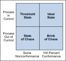
The Four Process States
Processes fall into one of four states: 1) the ideal, 2) the threshold, 3) the brink of chaos and 4) the state of chaos (Figure 1).
When a process operates in the ideal state, that process is in statistical control and produces 100 percent conformance, being predictable and meeting customer expectations. This state is only confirmed after the process has been under observation over a set period of time.
A process that is in the threshold state is still in statistical control even though it produces the occasional nonconformance. This type of process will produce a constant level of nonconformances and exhibits low capability. Although predictable, this process does not consistently meet customer needs.
The brink of chaos state reflects a process that is not in statistical control, but also is not producing defects. The outputs of the process still meet customer requirements, but the unpredictability means the process can produce nonconformances at any moment.
The fourth process state is the state of chaos. Here, the process is not in statistical control and produces unpredictable levels of nonconformance.
Figure 1: Four Process States
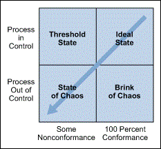
Every process falls into one of these states at any given time, but they all tend to gravitate toward the state of chaos. Companies typically begin some type of improvement effort when a process reaches the state of chaos (although arguably they would be better served to initiate improvement plans at the brink of chaos or threshold state). Control charts are used to prevent this natural degradation and steer performance back to the ideal state.
Figure 2: Natural Process Degradation
Elements of a Control Chart
There are three main elements of a control chart as shown in the figure below:
- A control chart begins with a time series graph.
- A central line (X or process location) is added as a visual reference for detecting shifts or trends.
- Upper and lower control limits (UCL and LCL) are calculated from available data and placed halfway from the central line. This is also referred to as process dispersion.
Figure 3: Elements of a Control Chart
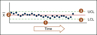
Control limits (CLs) ensure time is not wasted looking for unnecessary trouble – the goal of any process improvement practitioner should be to only take action when warranted. Control limits are calculated by:
- Estimating the standard deviation of the sample data
- Multiplying that number by three
- Adding (3 x s.d. to the average) for the UCL and subtracting (3 x d.v. from the average) for the LCL
4 - Histogram: for frequency of numerical values. It consists of a display where the data is grouped into ranges and then plotted as bars. To construct a histogram, the first step is to "bin" the range of values—that is, divide the entire range of values into a series of intervals—and then count how many values fall into each interval. The bins are usually specified as consecutive, non-overlapping intervals of a variable. The bins (intervals) must be adjacent, and are usually equal size.
Histograms are often confused with bar charts. A histogram is used for continuous data, where the bins represent ranges of data, and the areas of the rectangles are meaningful (rectangles touching each other indicates data continuity, thus the gaps between bars matter), while a bar chart is a plot of categorical variables and the discontinuity should be indicated by having gaps between the rectangles, from which only the length is meaningful. Often this is neglected, which may lead to a bar chart being confused for a histogram.
5- Pareto Chart: Pareto is a widely known concept used to explain which causes are responsible for the biggest consequences. The classical definition is that 20% of the factors are responsible for 80% of the effects. Pareto diagram is a column chart where single values are arranged according to their significance. The greatest values are on the far left while to the right are the smaller values, the lengths of which represent frequency or cost (time or money). The Pareto chart is used to identify the root-causes that most influence the occurrence of problems.
6- Scatter diagram (also called scatter plot)- Graphs pairs of numerical data, one variable on each axis, to look for a relationship. It uses carthesian coordinates to represent two variables for a set data. Two variables is typically used as use of thsi tool is supposed to look for a relationhsip between the compared values. Colour-coding the points allows for more variables.
A scatter plot can be used either when one continuous variable that is under the control of the experimenter and the other depends on it or when both continuous variables are independent. If a parameter exists that is systematically incremented and/or decremented by the other, it is called the control parameter or independent variable and is customarily plotted along the horizontal axis. The measured or dependent variable is customarily plotted along the vertical axis. If no dependent variable exists, either type of variable can be plotted on either axis and a scatter plot will illustrate only the degree of correlation (not causation) between two variables.
A scatter plot can suggest various kinds of correlations between variables with a certain confidence interval. For example, weight and height, weight would be on y axis and height would be on the x axis. Correlations may be positive (rising), negative (falling), or null (uncorrelated). If the pattern of dots slopes from lower left to upper right, it indicates a positive correlation between the variables being studied. If the pattern of dots slopes from upper left to lower right, it indicates a negative correlation. A line of best fit (alternatively called 'trendline') can be drawn in order to study the relationship between the variables. An equation for the correlation between the variables can be determined by established best-fit procedures. For a linear correlation, the best-fit procedure is known as linear regression and is guaranteed to generate a correct solution in a finite time.
One of the most powerful aspects of a scatter plot, however, is its ability to show nonlinear relationships between variables. The ability to do this can be enhanced by adding a smooth line such as loess. Furthermore, if the data are represented by a mixture model of simple relationships, these relationships will be visually evident as superimposed patterns.
When to Use a Scatter Diagram:
-When you have paired numerical data.
-When your dependent variable may have multiple values for each value of your independent variable.
-When trying to determine whether the two variables are related, such as…
-When trying to identify potential root causes of problems.
-to determine objectively whether a particular cause and effect are related on a fishbone diagram.
-When determining whether two effects that appear to be related both occur with the same cause.
-When testing for autocorrelation before constructing a control chart.
7 -Stratification - (also called flowchart or run chart) A technique that separates data gathered from a variety of sources so that patterns can be seen (some lists replace “stratification” with “flowchart” or “run chart”). A technique used in combination with other data analysis tools, it uses data from a variety of sources or categories that have been lumped together, separating.
7 -Stratification - (also called flowchart or run chart) A technique that separates data gathered from a variety of sources so that patterns can be seen (some lists replace “stratification” with “flowchart” or “run chart”). A technique used in combination with other data analysis tools, it uses data from a variety of sources or categories that have been lumped together, separating.
When to Use Stratification:
1-Before collecting data.
2-When data come from several sources or conditions, such as shifts, days of the week, suppliers or population groups.
3- When data analysis may require separating different sources or conditions.
Stratification Procedure
Before collecting data, consider which information about the sources of the data might have an effect on the results. Set up the data collection so that you collect that information as well.
When plotting or graphing the collected data on a scatter diagram, control chart, histogram or other analysis tool, use different marks or colors to distinguish data from various sources. Data that are distinguished in this way are said to be “stratified.”
Analyse the subsets of stratified data separately. For example, on a scatter diagram where data are stratified into data from source 1 and data from source 2, draw quadrants, count points and determine the critical value only for the data from source 1, then only for the data from source 2.
References:
https://en.wikipedia.org/wiki/Ishikawa_diagram
https://en.wikipedia.org/wiki/Check_sheet
https://en.wikipedia.org/wiki/Control_chart
https://en.wikipedia.org/wiki/Histogram
https://en.wikipedia.org/wiki/Pareto_chart
https://en.wikipedia.org/wiki/Scatter_plot
https://en.wikipedia.org/wiki/Stratified_sampling
http://www.itl.nist.gov/div898/handbook/pmc/pmc.htm
http://www.astroml.org/user_guide/density_estimation.html
http://www.psychwiki.com/wiki/What_is_a_scatterplot%3F
No comments:
Post a Comment